
"Remove the limits to your imagination"
- Rebekah Hall
- Nov 3, 2023
- 8 min read

And other Tom-isms from the Chandler School of Interior Decorating
By Rebekah Hall Scott


Tom Chandler waxing poetic about a velvet tufted ottoman with a dressmaker skirt; Tom holding one of his favorite decorating elements, a Japanese obi.
Butter Yellow Home took a little break during the wildly busy months of September and October, but I'm back to share some insights from where I've been spending my Tuesday nights for the past several weeks: the Chandler School of Interior Decorating, led by Arkansas design legend Tom Chandler.
I first learned about Tom when I interviewed landscape designer Daniel Keeley for an At Home in Arkansas story. When I asked Daniel about his choice to use a pedestal table on a garden patio, rather than a legged table, he said combining "leggy with non-leggy" pieces to create a cleaner sightline among chair legs is one of Tom Chandler's hard and fast rules. I asked him to say more about this, and Daniel mentioned Tom's interior decorating class. A few months later, I enrolled in the same 10-week course, starting the first Tuesday in September.
Over the last nine weeks, I've gained plenty of insight about interior design and about the experience of designing in the South, specifically, because Tom is so deeply in and of the South — his accent and mannerisms, his approach to people and relationships, his innate understanding of an indulgent elegance and formality in design that is distinctly Southern. Tom is an Arkansas native, and Chandler and Associates is a full service design firm that's been in business in Little Rock since 1980. (As Tom says, "We're incredibly full service; we take the dog out for you.") In that time, he and his team have worked with clients all over the country, but he is especially beloved in the Natural State. He's worked with wealthy, high profile families — including the family who owns "all of the helium in North America," for example, and the family who owns the Oaklawn racetrack and casino — as well as more modestly-funded residents looking for design direction. And he charges them all the same rate.
Tom is a character, full of energy and enthusiasm. He's 83, with plenty of white hair, always sporting his signature round glasses and black Birkenstocks with socks. (As a Birkenstock loyalist, I respect and understand.) He's warm and charismatic, and he's not precious about the knowledge he's gained over his decades in design. He wants to share it. He's taught more than 12,000 students through the Chandler School, and I think that teaching brings him as much satisfaction and joy as design does. It seems that for Tom, they go hand in hand. Isn't that the mark of a true master — the ability and desire to share that earned knowledge with others? As the daughter of two teachers, I recognize the spark in Tom's eye when he's at the front of the classroom, walking us through arranging bookshelves. I recognize the gesticulations that come without a second thought and how quick he is to find an illustrative anecdote.
He has told the class many times that part of being a good designer is being a good listener, and I would add to that the importance of curiosity: about people, about their inner lives, their values, their ideas of what home means and feels like. Tom is curious about people in this necessary way. To toot my own lil horn, curiosity is also a vital quality for journalists, and it's something I have in spades. I never met a rabbit hole I didn't like.
In this same vein, one of the tenets that will stick with me is Tom's insistence that, "Your home is the best it can be when it is an extension of your taste and personality; it's not for anyone's pleasure but your own." Our homes are best when they feel like us, when they bring us joy, peace and comfort, when we see ourselves represented in our spaces and among our possessions.
Learning from Tom has been delightful and inspiring. Below, I'm sharing a run-down of some of my favorite pieces of advice, "rules," ideas, and Tom-isms from a truly wonderful teacher.
"No weak angles"
Tom insists that furniture should be placed straight-on or at a 45 degree angle; anything else looks accidental and makes the furniture seem confused of its purpose. For example, if we imagine a seating group of a sofa and two armchairs, the sofa should face straight on, and each chair should flank the sofa "on a 45," as Tom says.

In the above example from the home of one of my favorite interior designers, Bunny Williams, note how the sofa (with gorgeous nail head trim and delightfully shaped arms and base) is placed against the wall and faces straight on into the room. But the antique wood chair to the left and the lush French armchair to the right are both set at 45 degree angles. This placement looks and feels intentional, focused. This room is also a great example of another of Tom's rules, which is:
Surfaces within comfortable reach of all seating
Tom says that from every available seat in a room, a surface should be conveniently in reach. "The surface should be big enough for a scotch and water, a Bible, or all three," Tom says. In Bunny's study above, the bench used as a coffee table and the metal side table on casters both offer a place for guests to set down a drink or a plate of hors d'oeuvres. [Sidetracking here to say that Bunny Williams got her start at the legendary Parish-Hadley design firm in New York, where she says she learned the importance of this same idea. At the core of convenience is comfort — making it easy for people to enjoy and use a space.]
Art placement should be "in conversation" with furniture
To create a sense of cohesion, Tom recommends arranging furniture first and then hanging art in relation to the furniture. The placement of the art should speak to, or be in connection with, where the furniture sits. He demonstrated this by holding a painted canvas above a chair, starting with the art touching the back of the chair, and slowly raising it higher up the wall above it, asking the class to raise our hands when the painting no longer felt "in conversation" with the chair. After a short period, the visual distance between the two objects felt random and unmoored; but if too close, it's impractical and uncomfortable.

Above, in Tom's own home, notice how the framed Asian screen hangs in relation to the side table. It's cozy with the table, nestles behind it in a way that allows the lamp to cast an even warmer glow in this corner. Hung any higher — or any further towards the chaise lounge — it wouldn't have quite created this moment. When it comes to buying art for your home, I love Tom's stance: "You don't need to buy art to coordinate with furniture or paint colors," he says. "Find art that you love and can live with for the rest of your life." Everything else can, and will, fall in around it.
Note: Tom advises that furniture arrangement should take into consideration several factors, including: traffic flow, or how people naturally move through the room based on its architecture and function (is this a high traffic area like a mudroom or entryway, where people should be able to walk without bumping into furniture?) ; "fixed" visual elements of a room, such as windows and doorways or other built-in features. In other words, arranging around the things we can't change; and conversation. "We are inviting conversation," Tom says. "We want people to be able to look each other in the eye and hear each other." In other words, furniture should be close enough together that the people seated there can actually talk to each other.
Odd numbers > even numbers
Though this is certainly not always the case — Tom is also a fan of symmetry — odd numbers are especially more compelling when it comes to creating little vignettes within bookshelves or on surfaces like side tables. A trio often feels visually stronger than a set of two; there's something pleasing about one thing being flanked by two things, or a stack of three books rather than a stack of four.

On my own bookshelves at my office — which is always a work in progress — you'll see the use of threes and the creation of "visual triangles," another technique Tom advises. In the upper right corner, the little miniature room diorama becomes a triangle with the two saucers in front of it; on the lower shelf, two stacks of three books each create little islands and add dimension. This is definitely not a hard and fast rule, but it's a handy one to have in your pocket when arranging or rearranging a little surface in your home.
Hang curtains at the top of the wall, all the way to the floor
Listen. I'm a girl with taffeta curtain dreams on an Ikea curtain budget, and there's nothing wrong with that. Window treatments — don't you just love that phrase... that window is getting TREATED y'all — by Tom's own admittance, can get very expensive, very quickly. Especially in a home like ours, which is blessed with 11-foot ceilings, finding panels with enough fabric to start at the crown molding and pool up at bottom of the baseboards is hard to do. But it really does look better when curtains cover the entire vertical, visual area of a window. If they're hung too short in either direction — they don't reach the floor or they start right above the window frame — it can look fractured and incomplete. This design concept is something to work towards, and it also doesn't always apply; Tom says that if the view from a window is beautiful, you don't need cover it. Simple as that.

Above is a lovely example of both of these ideas at play. In this room decorated by Wendy Nicholls for the prestige English firm Sibyl Colefax & John Fowler, we have a printed curtain hung high at the top of the wall and gathering on the floor behind the slipcovered chair (which is placed at...... a 45 degree angle!) We also have a set of French doors with stained glass borders leading to a porch of some sort. These doors are beautiful all by themselves, so this pocket went without window treatments. Also, we have a powerful set of odd numbers in the trio of framed drawings hung by chain above the doorway.
Surprise in design is delightful
I think this is in line with Tom's philosophy — and my philosophy, and really the only philosophy worth its salt — that interior design should feel personal and special to the occupants. Tom famously love to cover "negative" design aspects, such as light switches, outlets and thermostats, with shadowbox bug specimens (like....... so kooky we love it), and he also famously loves to put an unexpected object in the sink. These little pops bring joy to the inhabitants and a fun thrill to guests.

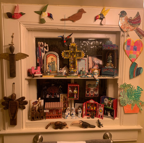


Above, two recent surprises that made me smile: On the left, a collection of little nativities, miniature scenes, and other treasures creates a burst of color and joy in a tiny under-the-stairs half bath at the home of a friend's parents. (My friend said her mom refers to this room as her "crying closet." Isn't that great? Don't we all need a crying closet?) On the right, an example of Tom's love for an object in the sink. "Those hippos are just on their way to the watering hole," Tom said of this pair. Why not, I say!
Taking Tom's class was a great experience, and it was fun to meet other local designers and design enthusiasts and journey through Tom's world together. I'm sure I'll be referring to these lessons and ideas for the rest of my design life. In closing, I'll leave you with Tom's motto and the parting words he shares us with at the end of every class: "Wake up early and be the best you can be!"


Comments